Packaging
Black Squid Design offers innovative packaging and label design that breathes life into a product (and keeps it alive long after the others have dropped off the shelf). We design an unforgettable experience.


The Floater - Small Batch Gin
Inspired by the quintessentially South Australian dish that is served best after a big night out.
The Pie Floater.
We are proud to have been selected as one of the 20 creative studios from around the world to design a package for a global initiative called ‘Make a Mark 2022’. The completed project was launched at Luxepack 2022 in Monaco!
The aim of the Make a Mark project is to showcase three key components of the package – A vessel. A label. Embellishments.
To represent global industry leaders Estal (Glass manufacturer and closure), Avery Dennison (Label stocks) and Kurz (Foils and embossing).
The Pie Floater is traditionally a meat pie, floating upside-down in a bowl of pea soup and eaten with the help of a spoon. Said to have been invented in the late 1800s in South Australia – the golden pastry of a meat pie, topped with a squirt of tomato sauce, sitting in a bowl of green pea soup.
Our approach was to deconstruct ‘The Floater’ using foil finishes and layers of sculptured & multi-level embossing to recreate the colours and textures of the meal ‘floating’ on the traditional white dish. Round bottle, embossed glass and printing on the reverse side of the back label, references the mushy pea soup.
Peas / Pie / Sauce


Olga's Fine Foods
Olga’s are shaking up the supermarkets with their attention grabbing quirky illustrations with bold variety colours and product colours.
Rebrand for Olga’s Fine Foods – The packaging needed to stand out on a shelf of full of clutter as bold, clean and memorable. The design required strong brand presence and differentiation across 6 ranges and various product types within each range. A light-hearted approach in a very conservative category. This solution has been instrumental in establishing a strong brand across all communication beyond just packaging.A tradition of innovation in meats and smallgoods.
Uniquely Olga’s – original home style recipes since 1978.


Botany - Native Flora
Botany is a way of life;
Botany is sustainable;
Botany is essential.
The innovative Botany Native Flora range is made using naturally derived indigenous plant ingredients, formulated to harness and share the significant benefits of Australia’s native flora. We wanted to hero; ingredient, nature, country, and use, while bringing you back to nature.
We crafted character illustrations for each individual product who embodied the natural ingredients, brought to life through movement, form, and nature’s touch. They showcased; use, ingredients and brought a unique look to a very minimal looking market. The colour choices were inspired by the hero ingredients, the application of this was distinctive by utilising an almost no white approach to pack.
Simple, Effective, Pure.


&Peabody Spirits
Turning every bottle into an unadulterated celebration of new experiences shared with &Peabody.
Meet &Peabody Spirits, previously known as Magpie Distilling. We redesigned the packaging and brand to better reflect the owners’ personality—emphasising quality, creativity, and fun, while embracing risks and quirky adventures. The three-wheeled bike logo mark symbolises the two owners’ creative minds combining into one quirky, unique third wheel – ‘You, me, and Peabody’. Thus, &Peabody was born. The packaging embodies the brand’s spirit through bold, multi-coloured foils and a distinctive bottle shape, complete with lively, colour-coded topper seals. Unique illustrations were created for each product, reflecting the ingredients, flavours, and expressions of each variety, setting them apart in a market often characterised by minimalistic designs. Buckle up and join them on this thrilling ride!
You, me, and Peabody.


Ambleside Distillers Gin
Ambleside Distillers has quite literally been ‘Built from the garden up’.
The new two-tone labels pay homage to the old branding, the arrow-like design reinvented to represent the three founding members building further success and the arrow pointing down to their roots and produce. The colours chosen represent the botanicals/ flavour profiles and textural differences that showcase physical qualities of the these. The bottle is completely custom, which has been uniquely designed, it’s beautiful to hold and to look at whilst also being practical.
Small Acre, Big Spirit.


Knappstein 1878 Transcendence
Transcending the expected to create something truly exceptional — Transcendence.
Knappstein’s brand mark features an abstract timeline running through the logo that bridges past, present, and future.
The bottle’s sophisticated design, luxurious packaging, and theme of timelessness help tell the story of Knappstein’s continuous journey of change. From its origins as a brewery in 1878, nestled in the heartland of the region, to what it is today – an iconic Clare Valley winery.
Harvesting heritage, Crafting excellence.


Kindly - Skincare
Meet Kind-ly Skincare; friendly skin essentials made from only Australian natural and organic ingredients, with a emphasis product transparency, suitable for all skin types.
The brief was to create a new line of products that were minimal, approachable, entertaining and had wide appeal to women of all ages. From this we created a visionary brand where every product is a celebration of femininity, lifestyle, and unadulterated fun.
We created a brand voice which was simple in approach: to redefine skincare as an experience that indulges not only the body, but the spirit as well. Lifestyle has been key to skincare and beauty across the ages and we decided to incorporate vintage cut-out photography of women displaying natural care free personality and pair this with a contemporary colour palette and clean typography, while holding onto premium cues.
Natural is the new normal, Live Kind-ly.


Goodies + Grains
Goodies + Grains is an artisan producer drawing on carefully selected ingredients to make diverse and beneficial foods, accommodating specific dietary needs with integrity.
The packaging holds onto the strength of the original brand by using a craft paper ‘look’ but bringing a freshness to the entire range. Using varying levels of opaque white and transparent inks gives layer and depth to the pack. Each range is colour differentiated to help the habitual purchase and on-shelf presence.
Providing quality food and knowledge to people who care.
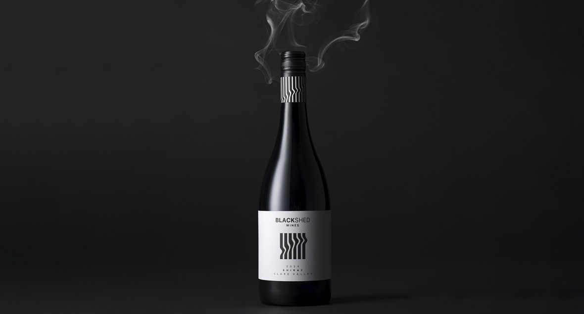
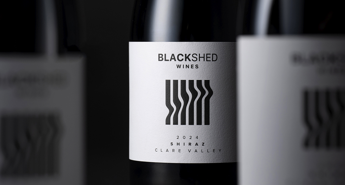
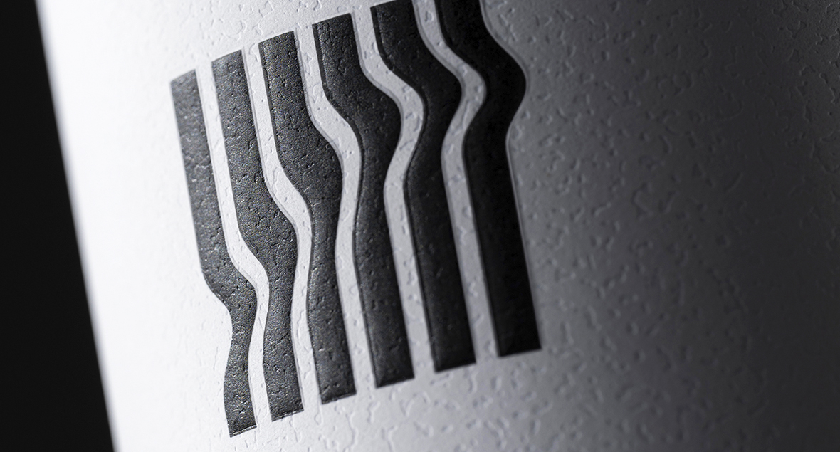
Black Shed Wines
“When a fire took our home and a lifetime of memories, we found strength in starting afresh.”
The wine reflects the family’s journey, rooted in resilience, forged through challenge, and crafted with care. From the ashes, Black Shed Wines was born. The label design is inspired by the story of the fire and the renewed life to rebuild. Smoke, burnt and twisted corrugated iron of the shed, and the black ash that remained.
Born from resilience, crafted with care.


Creative Native
Creative Native draws inspiration from the oldest culture on the planet and is committed to fostering an authentic Australian culinary experience.
The updated Creative Native logo features an approachable serif typeface and a colour palette of native green, wattle yellow, and ochre. The brand incorporates native fauna illustrations and textures.
The new packaging design for the popcorn range boasts sweet and spicy ingredients – indulge in the distinct flavours of Australia!
Share the flavours of the outback.
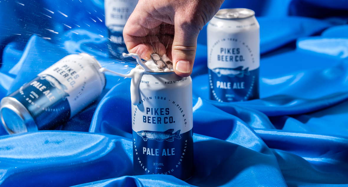
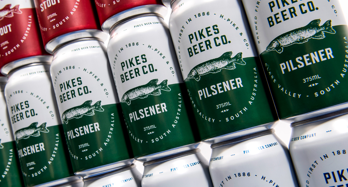
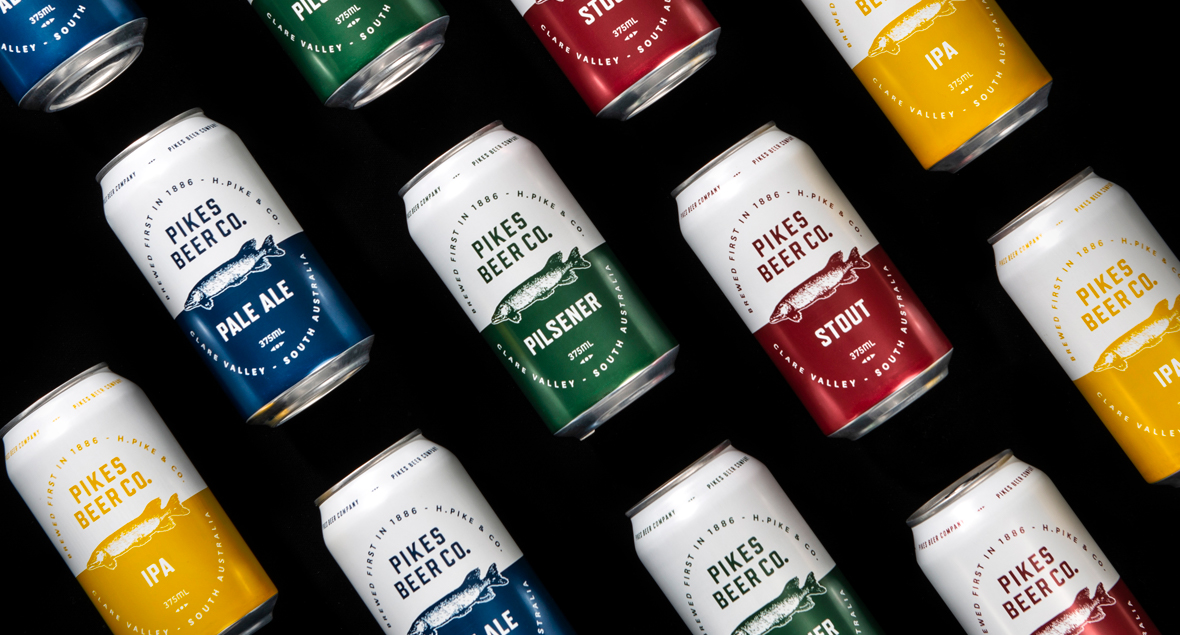
Pikes Beer Co.
Pikes Beer Co. is a family owned and operated craft brewery in South Australia’s Clare Valley. The core range new release packaging design – now in a can.
Swimming against the tide since 1886.


Weber
The brand new Weber seasonings and rubs – The handcrafted flavour range.
The design is clean and minimal with strong shelf presence, a strong range and varietal differentiation – while still reflecting the Weber brand. Weber rubs and seasonings have a unique point-of-difference in that the ingredients are smoked in a Weber.
A handful of flavour – smoked in the weber.


Mitolo Super Italia Lager
Mitolo’s first foray into the world of beer brings you Super Italia Lager, a refreshing tribute to classic Italian lagers.
The vibrant red, white, and green cans blend Italian heritage with a modern flair, their winding lines evoking the rolling hills of McLaren Vale and the graceful wave of the Italian flag.
A taste of Italy with an Australian twist.
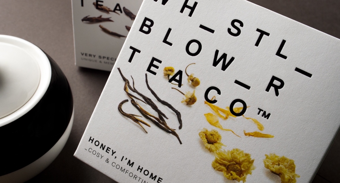
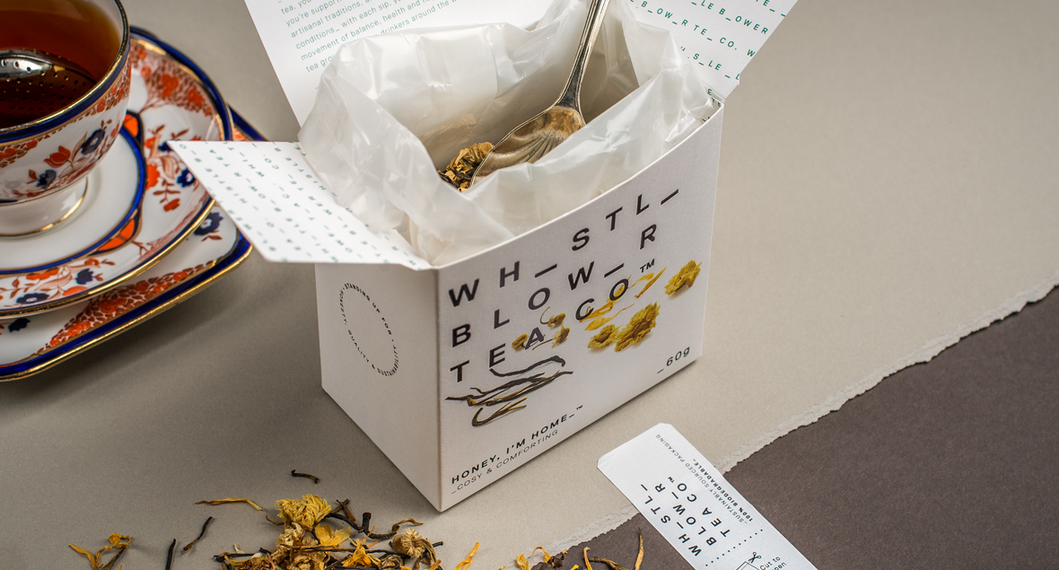

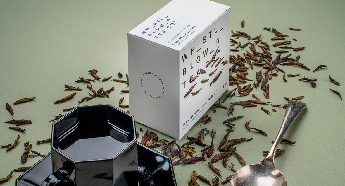
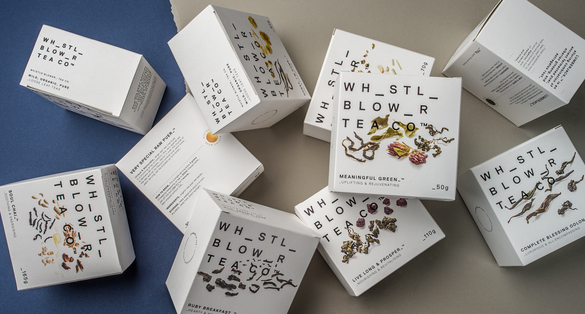
Whistle Blower Tea Co
In a saturated market the brand had to stand out as a premium tea for the masses, strongly pronouncing their philosophy of accessibility, honesty and sustainable.
Taking inspiration from whistle blowers and revolutionaries, release of information, codes and redacted documents, we trialled various combinations of missing letters to achieve the most readable outcome, with the brain naturally filling in the gaps in the logo.
The packaging also took a minimalist approach with the strong logo becoming a central feature paired with bold photography showing each individual ingredient in detail. The logo was printed in gloss black foil to contrast the detail of the images and the textured, uncoated and recycled stock.
Clean, bold and open to reflect the brands intentions and philosophy.


Pikes Beer Co. - Limited Release Beer
The limited release label range was designed to give an overall refined contemporary feel.
Taking inspiration from the freshwater Pike and their two-toned scales, with a simple minimalist look to break the mould of the typical craft beer. On each beer variety the golden scale moves its location.
The labels pattern mimics a textural raised fish scale feel while highlighting one gold scale to symbolise its rarity.

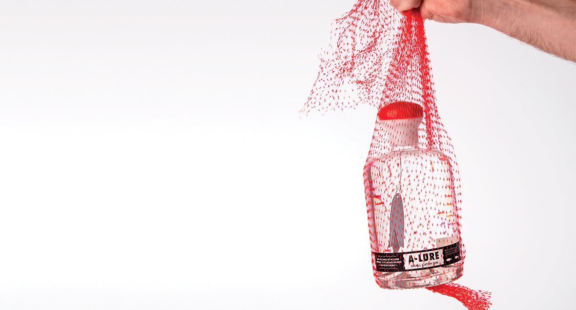

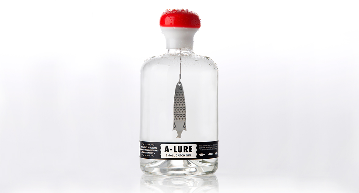
A-Lure
The limited release Gin of 40 bottles was created using 40 different botanicals over a 12 month ‘Gin Discovery’ period to come up with the perfect gin.
A Lure was laser cut from stainless steel, etched both faces and suspended the by stainless steel wire to hang inside the bottle in the crystal clear gin.
The cork has been double-dipped in white and red wax to reflect a ‘float’ to complete the surreal fishing scene.
A lure for the adventurous, it captivates while moving with the tide.

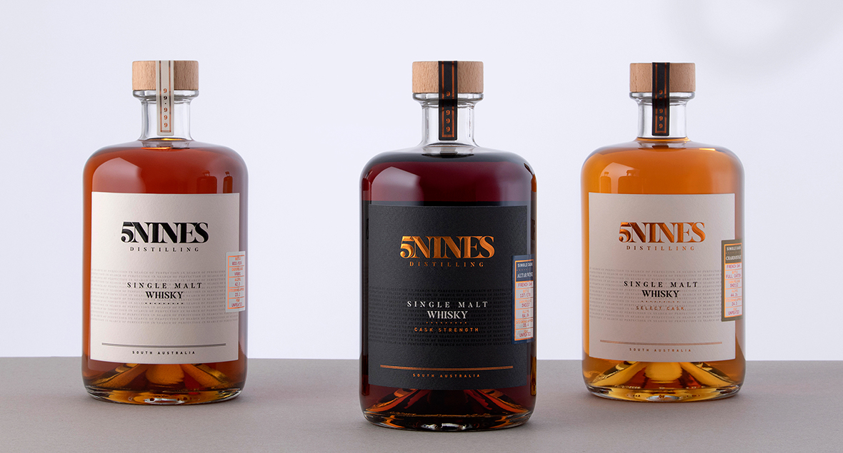

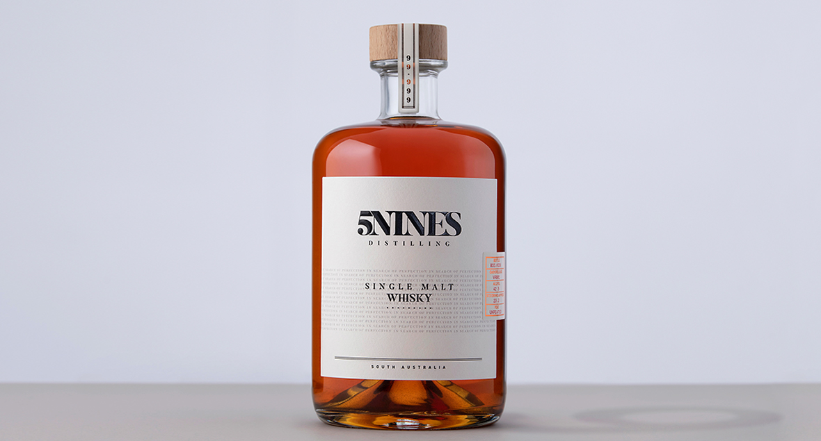


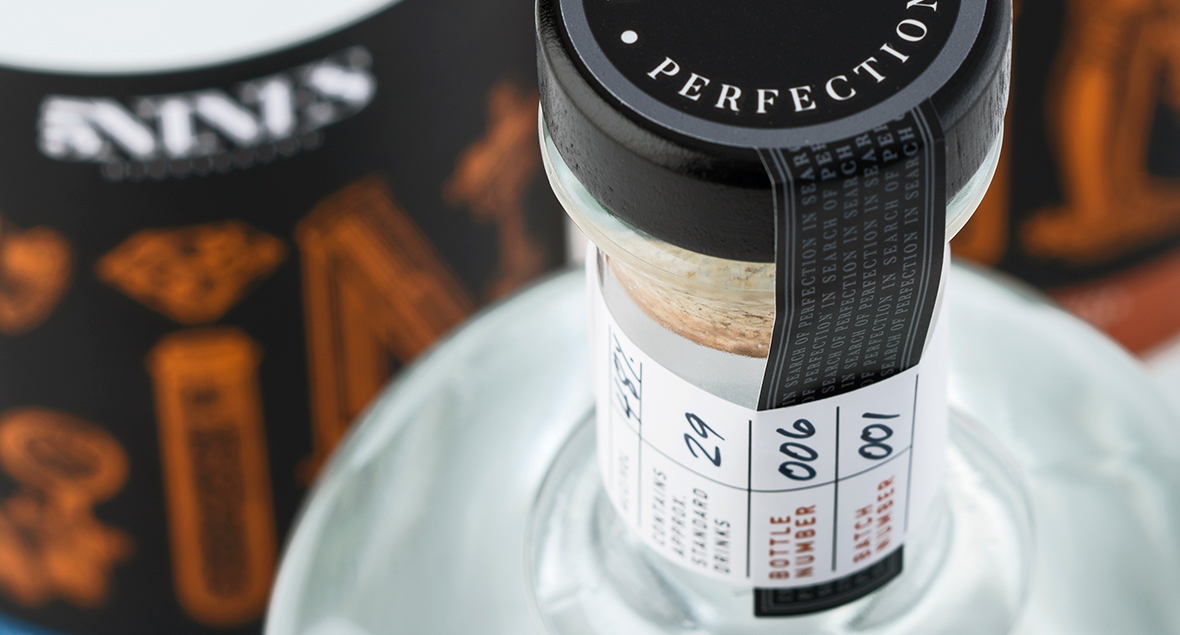
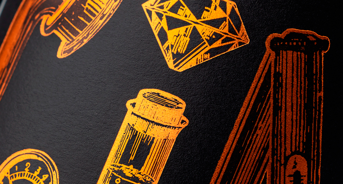
5Nines Whisky
A distillery located in the Adelaide Hills, specialising in small batch handcrafted spirits, established by two guys with one sole passion – to create the perfect spirit, 5Nines – 99.999% perfection.
The design needed to reflect the ever-present background thinking of this, the exclusivity and premium nature of each variety, while remaining true to the brand. It was important to highlight textural and sensory elements of the package to enhance the experience, such as the individual variety overlay labels, textured stock, raised sculptured emboss and foiled aspects.
The bottle’s wooden topper and seal ties back to the barrels that the whisky is matured in, and the continuous words printed in the background ‘in search of perfection’ inspired by the rings around the center of the barrels.
Creating an experience that is reflective of the product and the particular hands-on distilling process.
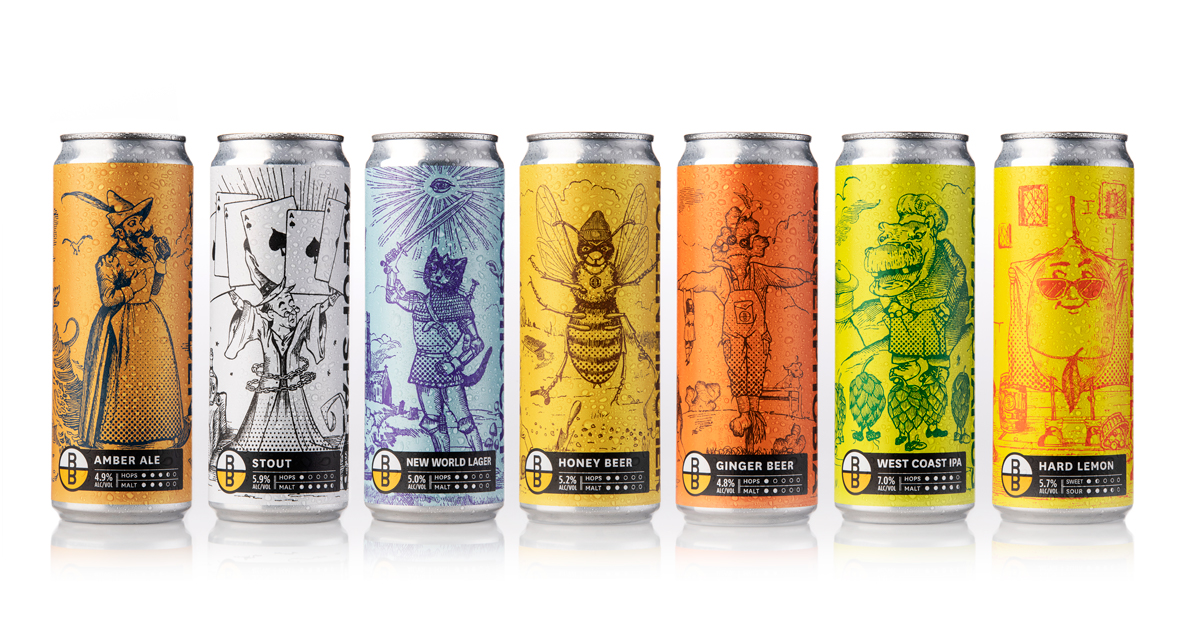


Brewboys Brewery
Brewboys Brewery & Tap Room emerged as one of the early craft producers in the SA brewing scene.
The family owned and run brewery has an evolving range of craft beers creating inspiring blends. They required an update to their labels to be consistent across the brand, while having individuality for each of the specific craft beer personalities. With a little bit of quirkiness to engage the customer and provide a memorable experience.
Each beer has a unique story – illustrations were created to reflect these different personalities.
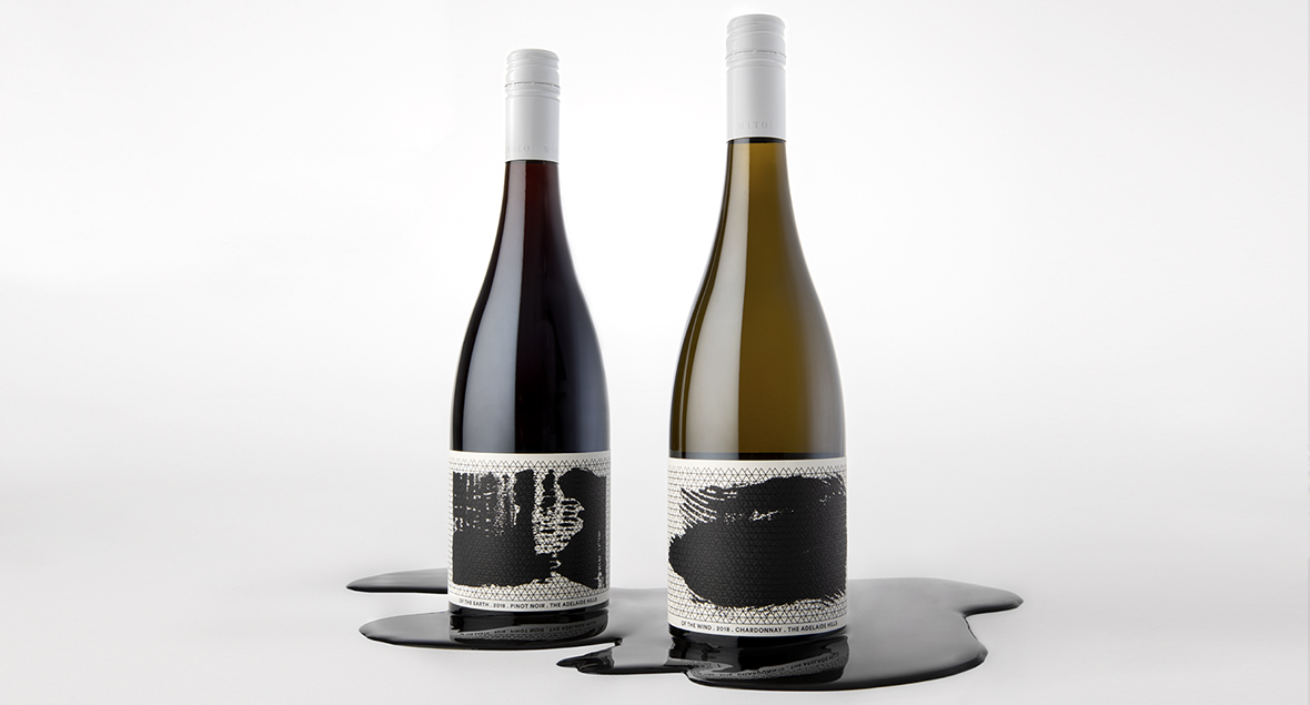
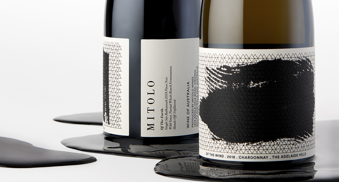
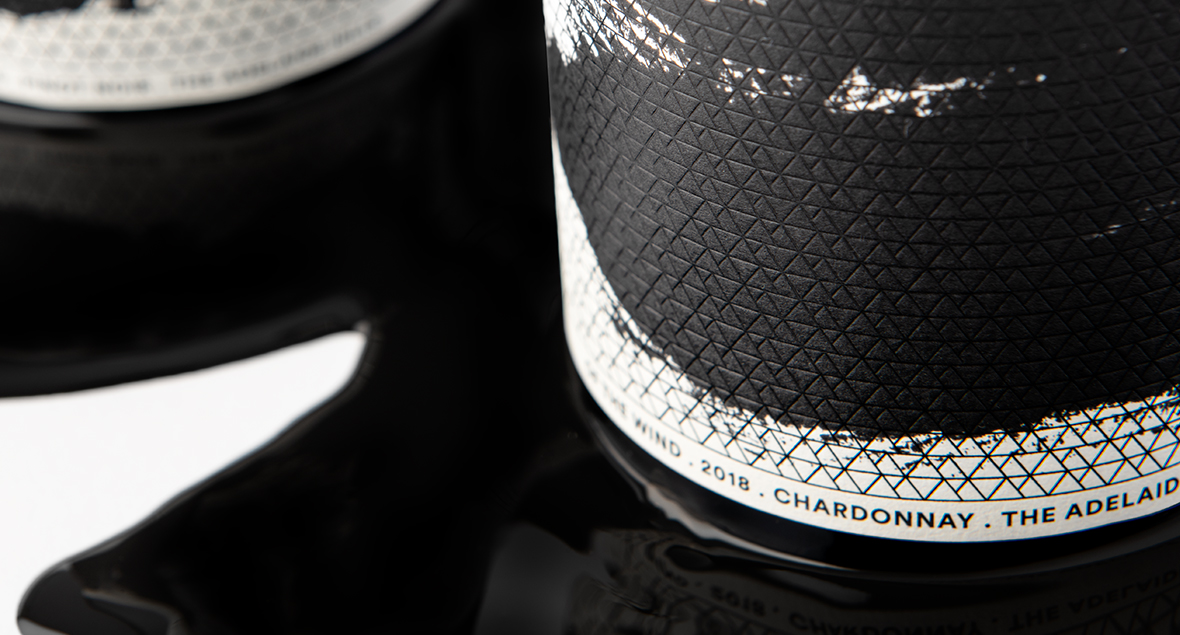
Mitolo
This was Mitolo’s first venture from the McLaren Vale region, to create a series of small batch Adelaide Hills wines.
The naming and design for the two varieties, ‘of the Earth’ and ‘of the Wind,’ reflect the climatic and soil conditions that make the Adelaide Hills an ideal region for superb wines.
The labels use a crisp black foil geometric pattern of mountains and representative of the Mitolo ‘M’, overprinting raw, textural relief prints.


Kind-ly
KIND-LY founder and CEO Lisa, identified a gap in the Australian market for an all natural deodorant that actually worked and was non-harmful to the body.
The deodorant was put through rigorous testing in the Brisbane sweltering heat and humidity – lasting all day without a whiff of B.O! And so, KIND-LY was born. Vegan, cruelty-free, proudly Australian made, 100% natural deodorant and armpit detox range.
The answer to armpit happiness.


Kirrihill Wines, Partner Series
Kirrihill is a boutique winery cultivating fine wines that capture the terroir of South Australia’s Clare Valley. The Partner Series is a family of fine, super-premium wines, each with distinct characters mirroring the three owners of Kirrihill.
The packaging was designed to convey a sense of traditional boldness, with simple minimalist cues, whilst shinning a spotlight on each of the partners personalities and the wines that they’re paired with.
Top of the hill is a reference for going through trials and tribulations and coming out on top.


Square1 - Gin
At their core, Square1 has an ethos based around journey, discovery, adventure, and risk taking.
The key in crafting the expression for their packaging was allowing each gin to display their individuality, after all, everyone takes a different path through the maze.
We created a branding mark that forms a maze using the open-ended negative space of the ‘S & 1’ encapsulating the overall brand messaging. The packaging varies from bottle to bottle, from bobbling square citrus fruit, to a ship lost in a maze of rough seas, each gin takes you on a journey, whist offering quirk and humour. We decided to incorporate the logo mark into each of the designs, making it develop into a part of the story, while also embracing the square theme.
Starting from Square one, has never been straight line.
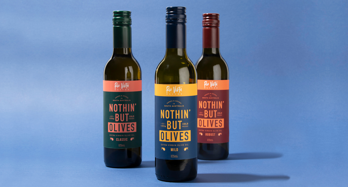

Nothin' But Olives
Let’s keep this simple. This bottle is filled with nothin’ but 100% South Australian grown and harvested olives.
Grown naturally in the Adelaide Hills and sunny Murraylands, picked by friendly people and cold extracted within 6 hours of harvest. No numbers, nothing imported, everything fresh.
100% Olive Juice. 100% Extra Virgin Olive Oil. So the label says it!
Let’s keep this simple!


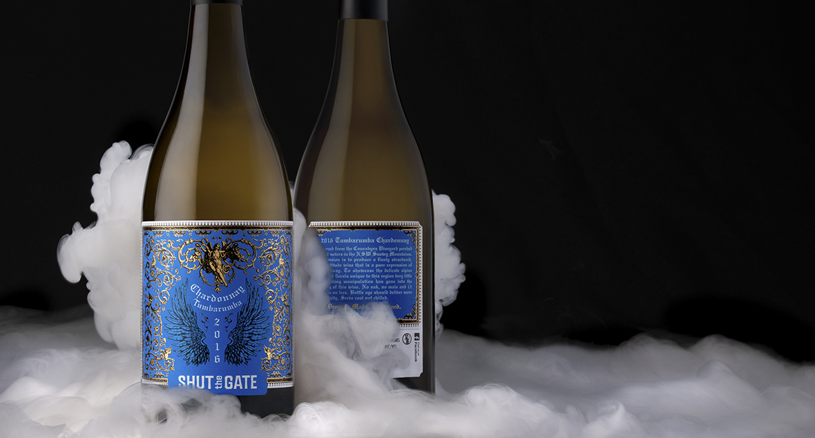
Tumbleweed
In the vast expanse of the arid plains, a lone tumbleweed embarked on a journey dictated by the whims of the relentless prairie winds.
With a weathered exterior and a heart of dried thistles, it rolled tirelessly across the sun-scorched landscape, a transient wanderer in the endless sea of golden grass. The tumbleweed’s dance was a graceful ballet, seemingly choreographed by unseen gatekeepers of the surreal, a silhouette painted against the fiery hues of the setting sun.
The label design is inspired by the presence of the iconic tumbleweeds in Western movies and literature – The Shut the Gate Tumbleweed range is light enough for brunch, chilled enough for lunch and complex enough to roll through dinner.
Keep on rolling!


Mr Nobody
Purveyor of strong wines and liqueurs.
A strong drink with more spirit than body.
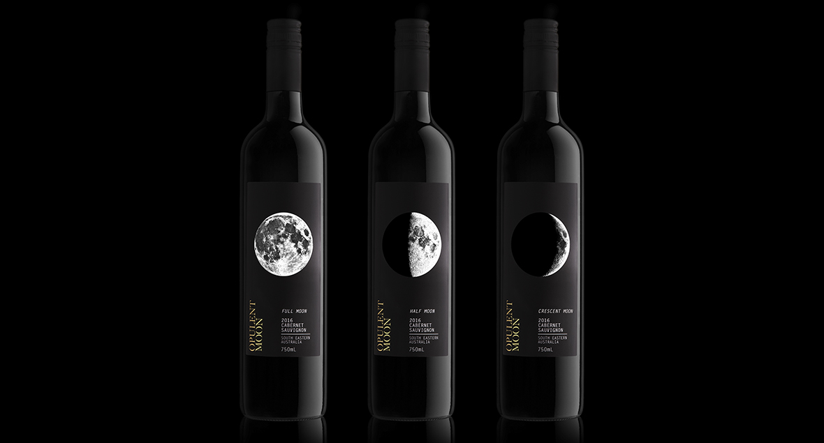
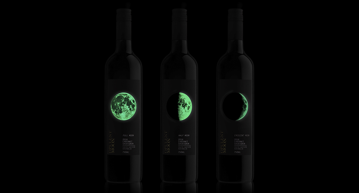
Opulent Moon
A series of three wines that depict the various stages of the moon cycle.
Inspiration
The client reminisced on a story. “When I was younger, I had a dream. I was in the schoolyard in China. I was surrounded by lots of cold concrete, I was by myself and I felt very alone. When I awoke from my dream, there was a full moon creating a soft, warm light from its glow. I felt safe.”
Glow-in-the-dark ink on the moon graphic highlights the client story for everyone to feel safe from the moons glow.


Doggy Grub
Doggy Grub born from a vision of changing the way we feed our dogs, one bowl at a time!
The packaging is bold, but approachable with a bucket-load of personality. Our illustrations attempt to capture the fun, pure nature of our dogs and how important the ingredients are to their happiness and health.
Fresh food, with ingredients you can recognise!


Shut The Gate, Tumbarumba Chardonnay
The existing Shut the Gate brand and wine labels revolve around various indirect gate references.
This Tumbarumba Chardonnay is sourced from the high altitude of the snowy mountains, we saw it fitting to continue this direction with a theme of ‘the gates of heaven’. We drew inspiration from illuminated religious manuscripts; rare, aged and highly decorated.
A complex gold foil was used, overprinted with black and embossed to reflect this luxurious, aged and textured motif.
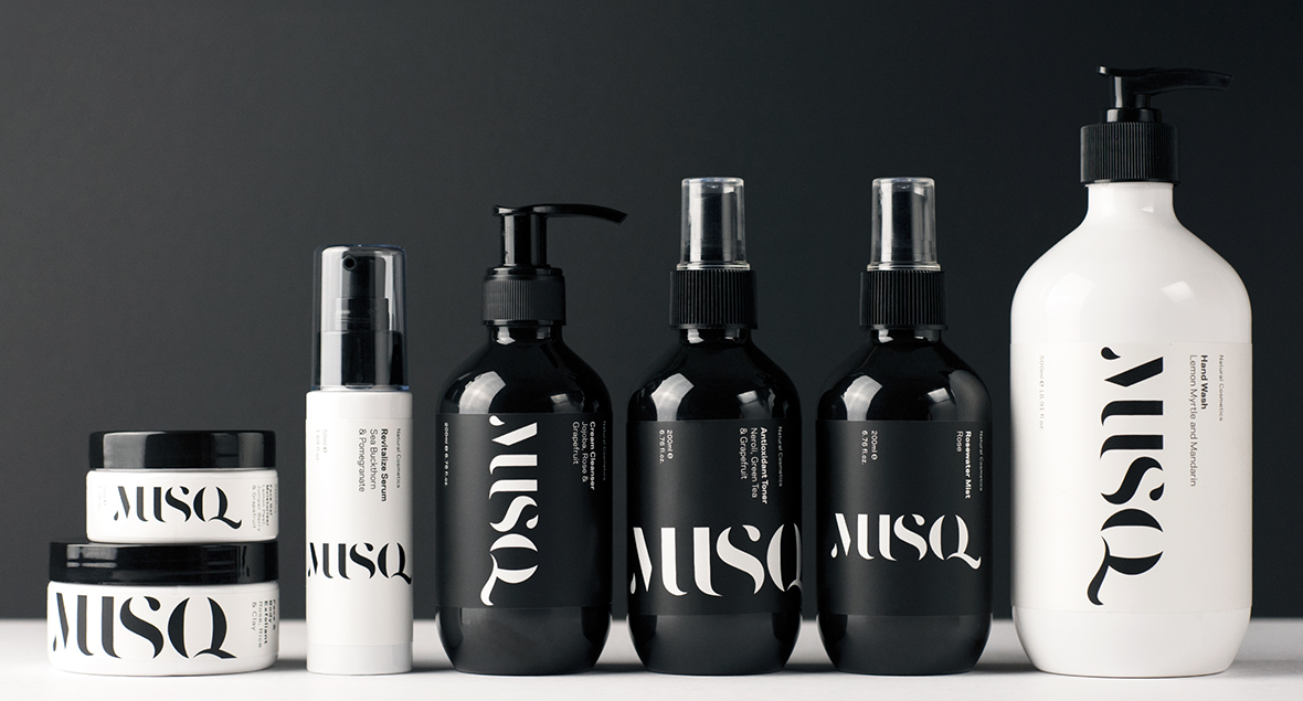


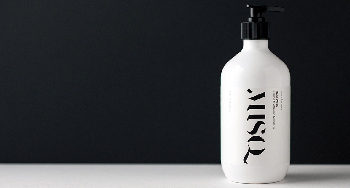
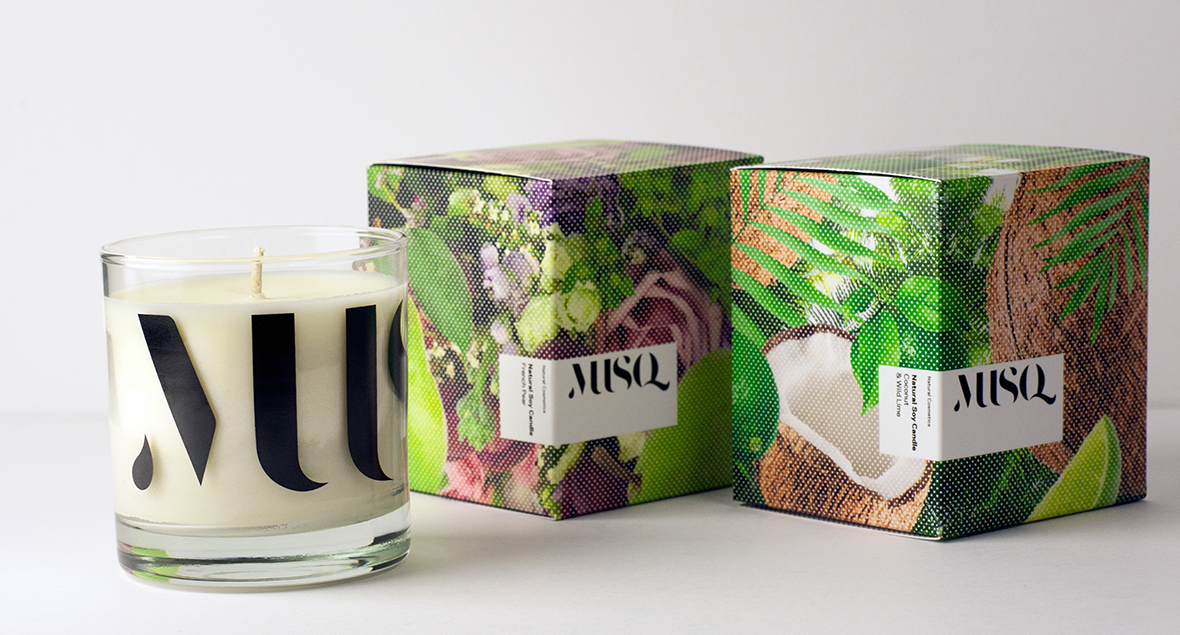
Musq Cosmetics
A sleek and upmarket brand for MUSQ Natural Cosmetics.
Musq is an Australian made, natural make up and skin care range. Musq uses real ingredients for real results with no hidden ingredients or hidden agenda.
The use of black and white to create a strong unified Brand Identity.


Grigori Wine Collection
Presenting the Grigori Family Reserve and Grigori Vintners Wine Collection.
The wines have been designed to transport the drinker into the vineyard, and express true varietal nature of the fruit and unique terroir of each wine.
Quality. Trust. Tradition.


Rio Vista - Single Variety
The Ultra-Premium range of 5 select mono-cultivar Extra Virgin Olive Oils.
The labels have been designed to visually represent each individual olive in shape, colour and texture, whist also acknowledging the country and region of original origin.
Single Estate Grown, expertly milled.


5Nines Gin
A small batch distillery located in the Adelaide hills of South Australia, specialising in hand crafted Gin and Single Malt Whisky.
At 5nines (99.999) they’re in search of perfection and leaving nothing to chance, even engineering and crafting their own still.
The label design features Illustrations that are inspired by the marriage between the hand crafted copper equipment and eclectic images relating to each variety.
This visual representation creates a unique personality that is reflective of each bottle of Gin and the distilling process.


The Lane
The Lane Vineyard in the Adelaide Hills have four distinct tiers of wine – Heritage, Estate, Provenance and Lane series.
A unique ‘sense of place.’
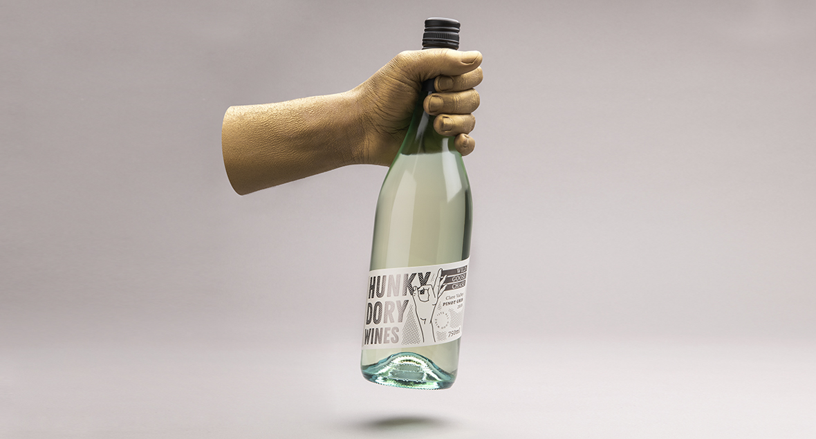


Hunky Dory Wines
A light hearted, entry level range of rosé and white wines.
Idioms and hand gestures were used to convey a lighter, more playful personality and connect the varietals to the brands name; reflecting the humour and sarcasm of the phrase “everything is hunky-dory.”
Pop art inspired, the labels use a halftone pattern with a luxe, contemporary style.


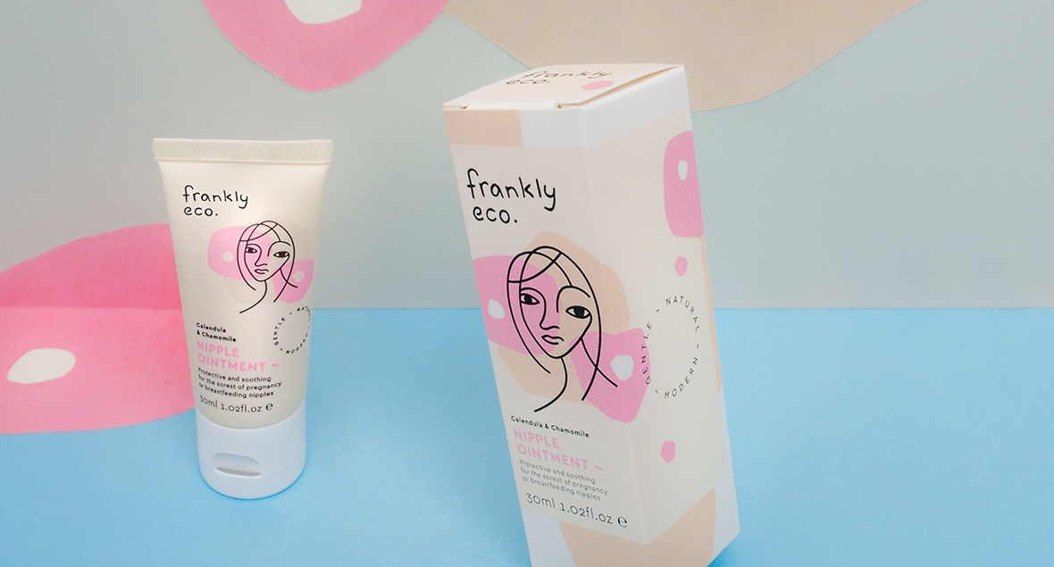
Frankly Eco
Logo, brand identity and packaging for skincare start up Frankly Eco that reflects their stance as a young, modern, ethical brand for Mothers and their babies.
Illustrated in the style of continuous line and cut paper. One layer indicating the category, the other adding calming colours and differentiating the individual products. A clean and modern feel, while maintaining personality and authenticity.
Natural, honest and ethical skincare range for mothers and babies.
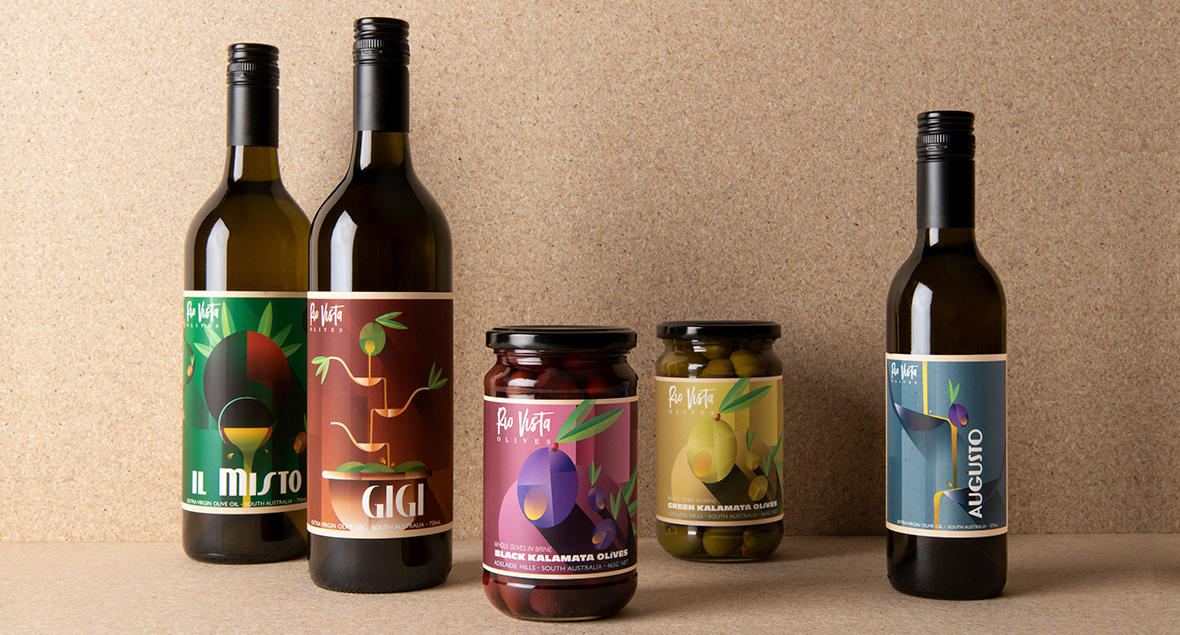


Rio Vista
Family grown and operated, Rio Vista Olives expertly crafting premium Extra Virgin Olive Oil. To make the small producer’s brand more distinctive by treating the labels more like a boutique wine, with a strong unique illustrative focus.
Inspired by travel posters of old, texture and playful motifs were woven into the visual language of each Illustration playing off the tasting notes of each variety.

Spencers Vodka
Taste.
Uncompromised.
Spencers.
Spencers Vodka is the result of an uncompromised pursuit of quality, a passion for exceptional taste, and a promise to create an ultra-premium vodka unlike any other.
Vodka enthusiasts who relished the traditional versions made from potatoes, they saw an opportunity to make a difference. The idea was born: why not transform the leftover sweet potatoes into a premium Vodka that would captivate taste buds and simultaneously address the waste issue?
A rich heritage of traditional vodka-making & embraced innovation.


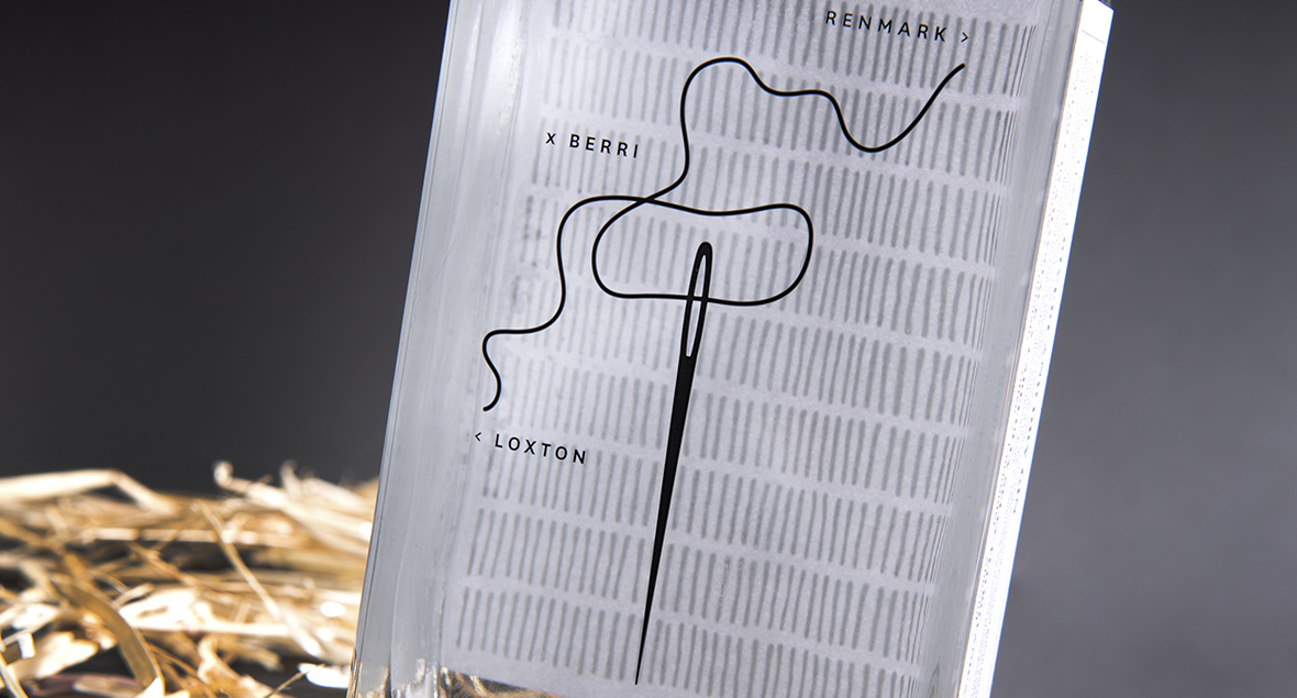
Needle and Pin
Named Needle & Pin — to reflect Cockney rhyming slang for Gin.
This label takes an Australian country twist, inspired by the saying ‘needle in a haystack.’ The front label artwork is made from hundreds of fine black strokes, one replaced with a small gold foil needle.
Like looking for a needle in a haystack.

Pikes Mid North
Crisp, clean and undeniably Australian.
Made in the Mid-North, for the Mid-North.
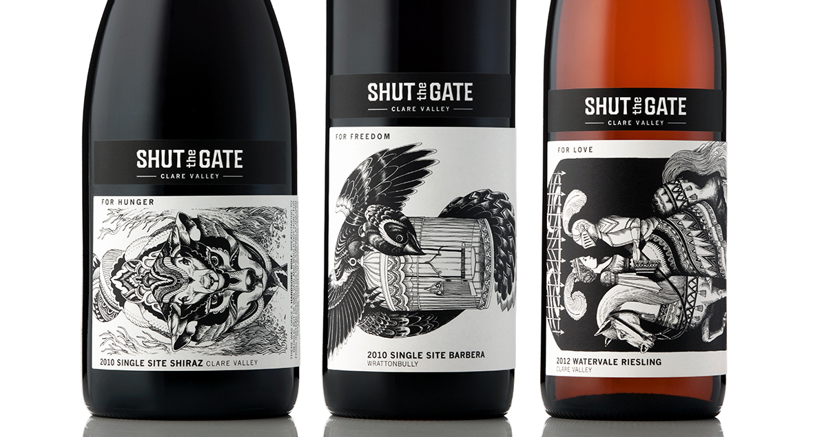
Shut The Gate Wines
A small wine producer that’s passionate about single site and best of region grape varieties.
The premium range illustrate three distinct shut the gate stories; for hunger, for love, and for freedom.
Detailed illustrations and stories bring the Shut the Gate brand depth, meaning and an engaging personality.

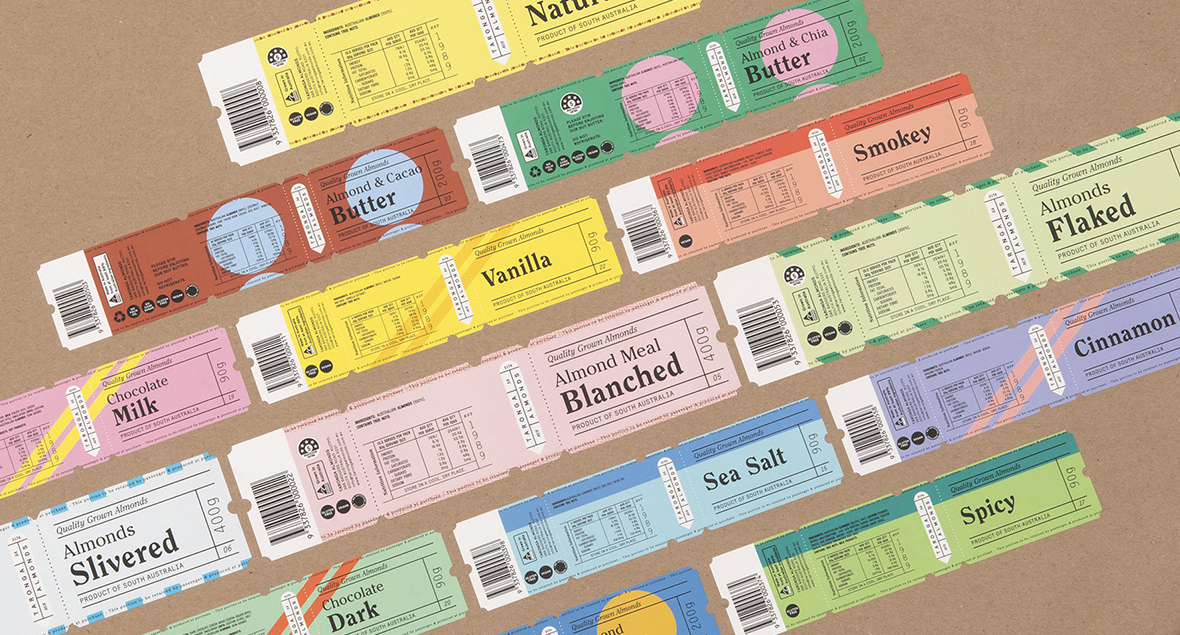
Taronga Almonds
Logo and packaging for Taronga Almonds range of nuts, butters and baking products.
Your ticket to quality.